A city can have many parks and still feel unequal in the way people actually reach them.
That is what makes nearest park mapping interesting. It is not only about where parks are placed on a map. It is about how close they feel in everyday life. A green space may look nearby in plan, but the actual walk to reach it can be much longer once roads, crossings, barriers, dead ends, and urban edges are taken into account.
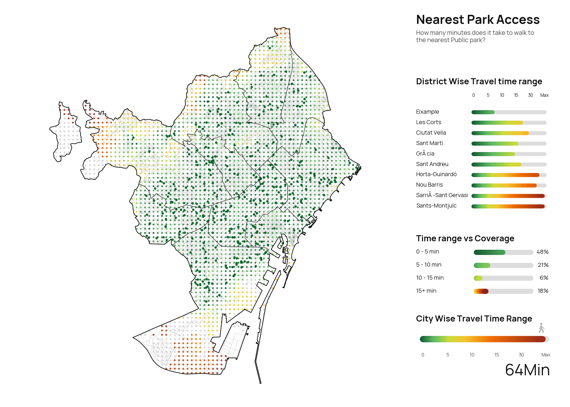
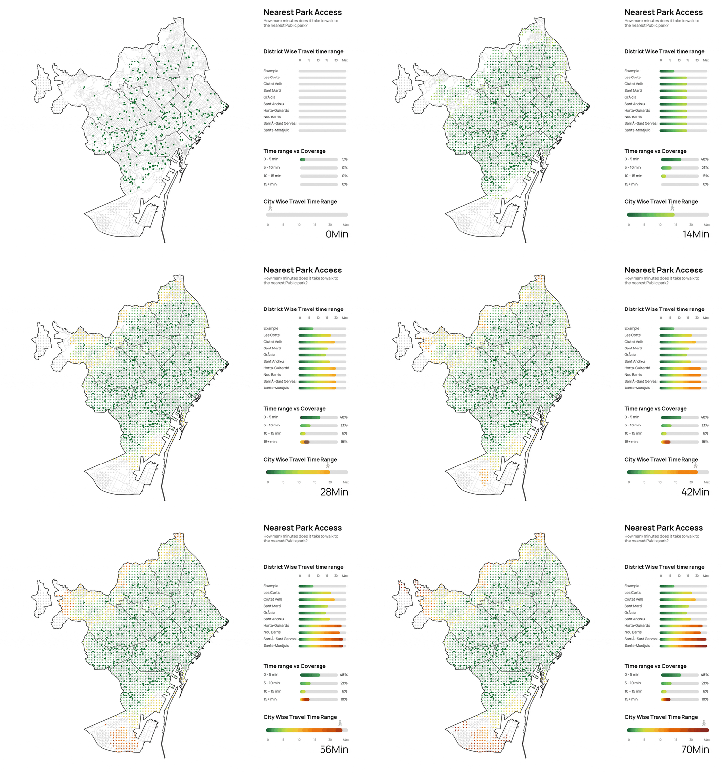
This is why nearest park mapping is useful. It turns a simple question into something spatial and visible: how long does it take to walk to the nearest public park from different parts of a city?
It sounds like a small question, but it opens up a much larger conversation about access, fairness, urban form, and daily life.
Looking Beyond Straight-Line Distance
When people think about access, they often imagine distance in the simplest way possible. If a park is close by, then access must be good. But cities do not work through straight lines. People move through streets, not through empty air.
A nearest park map tries to reflect that difference. Instead of measuring direct distance, it usually follows a walkable network of roads and paths and calculates the time needed to reach the nearest park from many different points across the city. The result is more meaningful than a simple radius around green space. It shows how the city is actually connected.
This matters because two places can sit at a similar physical distance from a park and still have very different levels of access. One may have a direct and comfortable route. The other may be interrupted by barriers, fragmented streets, or missing links in the network.
In that sense, nearest park mapping does not only tell us about parks. It also tells us about the structure of the city itself.
© Naveen Maria Fleming / ArchitectsWhoCode
Why Park Access Is Worth Measuring
Public parks are more than decorative spaces. They support exercise, rest, play, cooling, mental well-being, and everyday social life. For many people, especially those without private outdoor space, nearby green areas are one of the most important shared resources a city can offer.
That makes access just as important as presence. A city may contain large amounts of green space overall, but if access is uneven, then the benefit is uneven too.
Mapping nearest park access helps bring this into view. It can show where people are well served, where access is weaker, and where urban form may be creating unnecessary distance between residents and public green space. This kind of mapping is useful not only for planners and designers, but also for anyone interested in how cities distribute everyday quality of life.
What This Type of Map Can Reveal
One of the strengths of nearest park mapping is that it makes invisible patterns easier to notice.
It can reveal neighborhoods where access is consistently quick, suggesting a well-connected urban fabric and a relatively even distribution of public green space. It can also reveal parts of the city where the nearest park takes much longer to reach than expected. These longer travel times often appear in edge conditions, fragmented districts, industrial areas, or places where movement is interrupted by large infrastructure.
Sometimes the map also reveals something more subtle. It may show that the issue is not the absence of parks, but the weakness of the routes that connect people to them. In those cases, the problem is not simply “build more green space.” It may also be about improving pedestrian continuity, crossings, permeability, and access through the public realm.
That is why this kind of mapping can be so useful. It helps shift the conversation from simple proximity to actual accessibility.
© Naveen Maria Fleming / ArchitectsWhoCode
What the Map Cannot Fully Capture
At the same time, nearest park mapping should not be treated as the whole story.
A walking-time map is an interpretation. It can show likely access patterns, but it cannot fully describe lived experience. It usually assumes an average walking speed and a usable network. It may not reflect slope, comfort, heat, shade, lighting, traffic stress, safety, or whether a park edge is actually easy to enter. It also does not tell us whether the nearest park is large, welcoming, well maintained, or suitable for different groups of people.
This matters because good urban access is not only about time. It is also about quality. A short route can still feel unpleasant. A nearby park may still feel inaccessible in practice.
So the map should be understood as a strong indicator, not a complete definition of urban well-being.
The Assumptions Behind the Analysis
Every map like this depends on assumptions.
It assumes that the street or path network is mapped clearly enough to represent real movement. It assumes that people walk at a fairly consistent pace. It assumes that the nearest park is public and reachable. It often assumes that the shortest route is a meaningful substitute for the route people would actually choose.
None of this makes the method invalid. In fact, simplification is necessary to make city-scale analysis possible. But these assumptions still shape the result, and they should be acknowledged rather than hidden.
A useful accessibility map is not one that claims perfect truth. It is one that is transparent about what it measures.
The Real Challenges in Making These Maps
One of the most important things about nearest park mapping is that the final image may look smooth and simple, even when the process behind it is not.
In practice, urban network data often contains problems. Roads and paths that appear connected visually may behave like separate fragments in the actual graph used for analysis. Some edge areas may be difficult to model clearly. Industrial zones, ports, large infrastructure corridors, and boundary conditions can create misleading breaks in the network. In some places, accessibility may appear worse in the model not because people truly cannot walk there, but because the underlying geometry is incomplete or disconnected.
This is an important reminder: maps are not neutral outputs. They are built through data, assumptions, and technical choices.
That does not reduce their value. It simply means they need interpretation.
Why This Still Matters for Cities Everywhere
Even with these limitations, nearest park mapping remains a powerful urban tool.
It helps make access visible. It helps compare areas of a city in a simple and intuitive way. It helps identify where green access is uneven, where routes are weak, and where planning attention may be needed most. It also gives a clearer language for discussing public space, especially when conversations about equity remain too abstract.
Most importantly, this kind of mapping is not tied to one city alone. The same method can be relevant almost anywhere. Any city that wants to understand access to public green space can ask the same question: how long does it take people to reach the nearest park on foot, and what does that reveal about the city’s structure?
That is what makes the exercise broadly useful. It is local in application, but general in meaning.
Closing Reflection
Nearest park mapping matters because it turns a familiar urban concern into something visible and measurable.
It asks a direct question, but the answer reaches much further. It touches on movement, access, inequality, and the relationship between urban form and everyday life. A city may appear green in plan and still feel uneven in practice. This kind of mapping helps expose that difference.
It does not offer a perfect reading of the city. No single map can. But it does something valuable: it helps us move beyond assumption and begin to see access as a lived spatial condition rather than a simple geographic fact.
And that is often where better urban questions begin.