A practical workflow for understanding how cities grow over time
Cities are usually mapped as fixed objects. We see building footprints, roads, land-use zones, administrative boundaries, and transport networks as if they all belong to one single moment. But cities are not static. They are built gradually. They expand, densify, decay, regenerate, and reorganize themselves across time.
For anyone working with urban data, this raises an important question:
Can we map not just what a city looks like today, but how it has evolved?
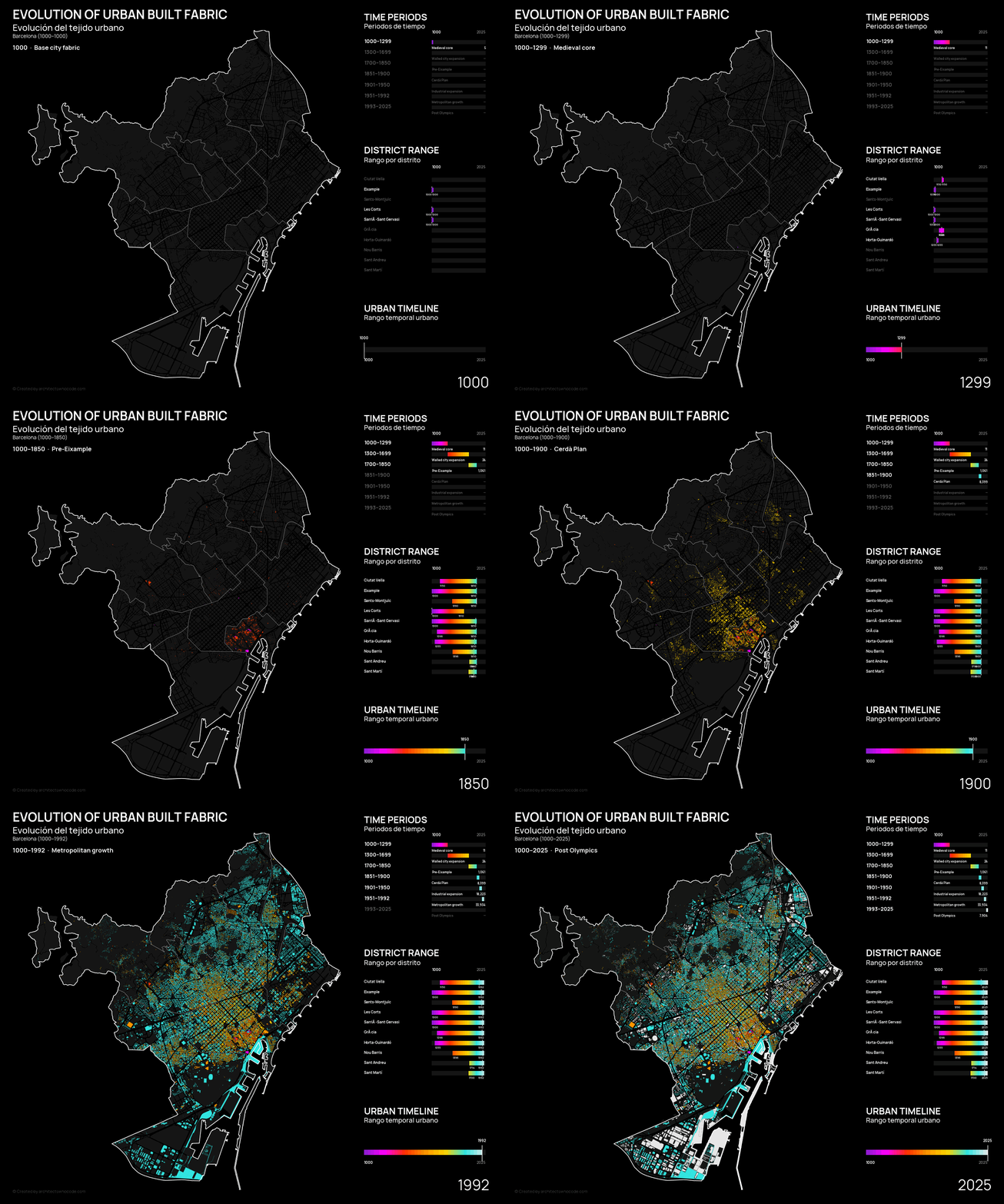
This article explores a practical workflow for visualizing the evolution of urban built fabric using geospatial datasets. The example I developed uses Barcelona as a case study, but the method is not limited to Barcelona. The same logic can be applied to any city where building footprints and some form of temporal information are available.
The goal is simple: transform raw urban datasets into a visual story of city growth.
© Naveen Maria Fleming / ArchitectsWhoCode
Why urban evolution mapping matters
Most urban maps describe the current condition of a city. They show where buildings are located, where roads pass, how land is used, and how administrative areas are divided. These maps are useful, but they often miss one critical dimension: time.
A temporal urban map helps us understand how different parts of the city emerged.
It can reveal whether an area is part of an old urban core, a planned expansion, an industrial belt, a post-war growth zone, a suburban extension, or a contemporary redevelopment district. Instead of seeing the city as one flat layer, we begin to see it as a sequence of accumulated urban periods.
This is valuable for urban data research because it connects spatial information with historical development patterns. It allows us to ask better questions:
Which parts of the city developed first?
Where did expansion happen most rapidly?
Which districts contain older building stock?
How does the road network relate to different phases of growth?
Are land-use patterns connected to the age of the built fabric?
Which areas show signs of long-term continuity or recent transformation?
These questions are useful for urban analytics, spatial research, digital mapping, real-estate intelligence, heritage studies, regeneration strategy, public communication, and data-driven urban storytelling.
The core idea
The method is based on one central dataset:
building footprints with construction year or building age information.
Each building polygon is assigned to a time period based on its construction year. Then the city is visualized frame by frame, showing buildings cumulatively through time.
For example, instead of displaying all buildings at once, the map can reveal them in stages:
Frame 1: buildings up to 1300
Frame 2: buildings up to 1700
Frame 3: buildings up to 1850
Frame 4: buildings up to 1900
Frame 5: buildings up to 1950
Frame 6: buildings up to 1990
Frame 7: buildings up to the present
The important part is that the animation is cumulative. Buildings from earlier periods remain visible while newer buildings are added. This better reflects how cities actually grow. Urban fabric is not replaced at every stage; it accumulates.
Each period can be given a different color, allowing the final map to show the chronological composition of the current city.
Barcelona as a case study, not the main point
Barcelona is a strong case study because its urban history has clear phases: historic core, walled city expansion, pre-Eixample growth, the Cerdà Plan, industrial expansion, metropolitan growth, and post-Olympic transformation.
But the workflow itself is general.
The same method can be used for London, Mumbai, Paris, São Paulo, Singapore, New York, Amsterdam, Dubai, or any other city where suitable data exists. The historical period labels will change, but the data logic remains the same.
For another city, the periods may be based on:
pre-industrial settlement
colonial expansion
industrial growth
post-war reconstruction
suburbanization
infrastructure-led expansion
contemporary redevelopment
The periods should always be defined according to the local urban story. The goal is not to force every city into the same timeline, but to create a structure that makes its growth understandable.
What datasets are required?
At minimum, this workflow needs three layers:
1. Building footprints
2. A temporal attribute such as construction year, age, or period
3. A city boundary or study-area boundary
With only these three datasets, it is already possible to create a basic urban evolution map.
However, the visualization becomes much richer when additional context layers are added:
district or neighborhood boundaries
road network
land-use polygons
parcels or cadastral boundaries
water bodies
coastline
rail or transit networks
green areas
administrative zones
These supporting layers help the viewer understand the geography behind the growth. Roads reveal structure. Land use reveals function. District boundaries help compare different parts of the city. The city boundary provides a clear frame for the analysis.
In the final visualization, these contextual layers should usually be muted. They should support the reading of the building evolution, not overpower it.
What if construction year data is not available?
This is one of the most important practical issues.
Many cities do not provide clean construction-year data. Some datasets have missing years, approximate years, renovation years instead of original construction years, or no temporal attribute at all.
That does not mean the workflow is impossible. It means the temporal attribute needs to be created or approximated using alternative sources.
Possible alternatives include:
Building age categories
Some cadastral datasets provide age ranges instead of exact years. For example:
before 1900
1900–1945
1945–1970
1970–2000
after 2000
This is enough for period-based visualization.
Building permit records
Planning applications and building permits can indicate when new construction, extensions, renovations, or demolitions occurred. These datasets are especially useful for mapping recent urban transformation.
Historical maps
Georeferenced historical maps can be used to identify when streets, blocks, or building areas first appeared. This approach requires more manual work, but it can be powerful for historic urban research.
Satellite imagery
For fast-growing cities or regions with limited cadastral data, satellite imagery can help detect built-up expansion over time. This is particularly useful for large-scale urbanization studies, peri-urban growth, informal settlement mapping, and regional development analysis.
OpenStreetMap
OpenStreetMap is useful for footprints, roads, amenities, and land-use information. However, OSM edit dates should not be confused with building construction dates. The date a building was added to OSM only tells us when it entered the database, not when it was built.
Global building footprint datasets
Where local data is limited, global datasets can provide a starting point. These may include open building footprints, satellite-derived settlement layers, and global built-up area products. They may not offer building-level construction years, but they can still support broader urban expansion analysis.
Useful dataset categories
The exact sources vary by country and city, but urban evolution mapping often depends on these categories:
municipal open-data portals
national cadastral datasets
regional GIS portals
planning application databases
building permit records
historic map archives
OpenStreetMap
satellite-derived built-up area datasets
land-use datasets
road network datasets
administrative boundary datasets
transport authority data
For building-level analysis, cadastral and municipal datasets are usually the strongest.
For neighborhood or city-scale growth analysis, building footprints with age categories may be enough.
For regional urbanization, satellite-derived built-up datasets may be more appropriate.
The data source should match the scale of the question.
Designing the map
The visual design of an urban evolution map is not just decoration. It determines whether the analysis is readable.
A useful layer order is:
1. dark background
2. land-use polygons
3. road network
4. building footprints colored by period
5. district or neighborhood boundaries
6. city boundary
The building layer should be the main visual focus. Roads, land use, and boundaries should remain visible, but not dominant.
A good visual hierarchy might look like this:
land use: dark grey, low contrast
roads: thin muted grey lines
district boundaries: semi-bright white lines
city boundary: stronger white outline
buildings: bright colors by period
This creates a map where the city’s growth is clear, while the underlying urban structure remains visible.
The same principle applies to animation. The background layers should stay constant, while the building layer evolves frame by frame.
Building the animation
The animation works by filtering the building dataset based on the current frame year.
The logic is simple:
For every frame, only buildings constructed up to that year are shown.
The timeline and district statistics should also update with each frame. This is important. If the map shows the city only up to 1900, the district chart should not display information from 2025. Otherwise the visualization shows future data too early.
A temporally consistent animation should update:
visible buildings
active period label
urban timeline
district or neighborhood statistics
building counts
minimum and maximum construction years
median construction year
This makes each frame represent the city as it exists at that specific stage of time.
What can be measured?
Once the data is cleaned and organized by period, the map can become more than a visual output. It can support actual urban analysis.
Possible metrics include:
number of buildings by period
built-up area by period
building age by district
median construction year by neighborhood
oldest and newest areas
growth intensity by period
land-use composition by building age
road density around different development periods
relationship between transit access and urban growth
heritage concentration
redevelopment potential
retrofit priority areas
These metrics can be used in dashboards, reports, interactive maps, or research visualizations.
Why this is useful?
Urban evolution maps are useful because they make complex spatial data understandable.
They can support:
Urban intelligence products
Companies working with property, infrastructure, mobility, or planning can use temporal building data to identify growth patterns, mature areas, redevelopment zones, and emerging districts.
Real-estate and investment analysis
Building age and development period can help identify where an area is established, transforming, underused, or likely to experience redevelopment pressure.
Public-facing urban storytelling
Cities, developers, institutions, and researchers often need to explain urban transformation to non-technical audiences. Animated maps communicate this more effectively than static tables.
Regeneration and retrofit strategy
Older building stock can be mapped and compared with energy performance, land use, density, or ownership data. This can help identify areas where retrofit or adaptive reuse strategies may be relevant.
Location analysis
For site selection, temporal context helps explain whether a location sits within a historic core, an industrial transition zone, a planned expansion area, or a newly developing district.
Digital city platforms
This workflow can become part of a larger urban data platform, where users explore building age, land use, mobility, density, infrastructure, and demographic layers together.
From static map to interactive product
A static poster or dynamic vis is a good first output, but the same workflow can evolve into interactive tools.
Possible next steps include:
time-slider web map
district comparison dashboard
building-age explorer
urban growth atlas
real-estate intelligence interface
planning data portal
interactive storytelling map
The technical stack can vary depending on scale:
GeoPandas for processing
Matplotlib for high-resolution maps
QGIS for checking and editing
PostGIS for spatial databases
DuckDB or GeoParquet for larger datasets
Leaflet or Mapbox for web maps
deck.gl for large-scale visualization
Kepler.gl for quick exploration
For smaller datasets, a Python-based workflow is enough. For larger cities or commercial platforms, the data should eventually move into a spatial database or vector-tile pipeline.
Limitations
Urban evolution mapping is powerful, but it must be presented carefully.
The first limitation is that most building-footprint datasets show the current city. If a building was demolished, it usually does not appear. This means the map shows the age of the current built fabric, not a perfect reconstruction of the historical city.
The second limitation is data quality. Construction years may be missing, estimated, outdated, or inconsistent.
The third limitation is interpretation. Historical periods are analytical categories. They should be chosen carefully and explained clearly.
The fourth limitation is visual bias. A polished map can appear more precise than the data actually is. Good urban data work should always communicate uncertainty.
A transferable workflow
The strength of this method is that it is transferable.
Barcelona may be the case study, but the workflow can be adapted wherever spatial and temporal urban data exists. The input data can change. The city can change. The period classification can change. But the structure remains the same:
collect spatial data
clean temporal attributes
classify buildings by period
visualize cumulative growth
add contextual urban layers
calculate area or district statistics
export maps, animations, or interactive tools
This turns a conventional building-footprint dataset into a temporal urban intelligence layer.
Conclusion
Mapping urban evolution helps us understand cities as layered systems rather than fixed objects. It connects building data, geography, and time into a clear visual narrative.
For urban data research and commercial mapping, this workflow can support many use cases: growth analysis, real-estate intelligence, regeneration studies, public communication, digital city platforms, and spatial storytelling.
The value is not only in producing a beautiful map. The value is in making urban change visible.
When building footprints are connected with time, the city becomes readable in a new way. We can see where it began, how it expanded, which areas transformed, and how the current urban fabric is made from many historical layers.
Barcelona is one example. The method belongs to any city.