How consistent are AI predictions in street views?
When we talk about street safety, we usually think about crime data, lighting standards, traffic, or security. But there is another important layer: how safe a place feels when people look at it.
This is called perceived safety.
A street may be statistically safe but still feel uncomfortable. Another street may feel welcoming because it has daylight, people, open views, greenery, cafés, and activity.
For this article, I wanted to test a simple question:
If different AI methods look at the same street image, do they give the same safety perception?
The goal is not to prove that AI can perfectly measure safety. It cannot. The goal is to understand how different AI methods read the same urban scene.
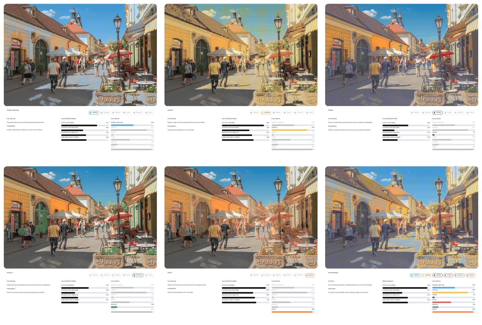
The experiment
I used one street image and tested it with four AI-based methods.
Each method reads the image differently.
The four methods were:
- CLIP Zero-Shot Safety
- CLIP Place-Pulse Style Safety
- Places365 Scene-Safety Prior
- Urban Cue-Based Safety Score
These are not meant to replace site visits, public surveys, or urban safety audits. They are used here as a quick visual experiment.
The idea is to see how AI reacts to visible street qualities such as lighting, openness, shadow, greenery, clutter, and activity.
Method 1: CLIP Zero-Shot Safety
The first method uses CLIP with simple prompts.
It compares the image against phrases like:
- safe urban street
- unsafe urban street
- well-lit pedestrian street
- hostile pedestrian environment
This method gives a quick first impression.
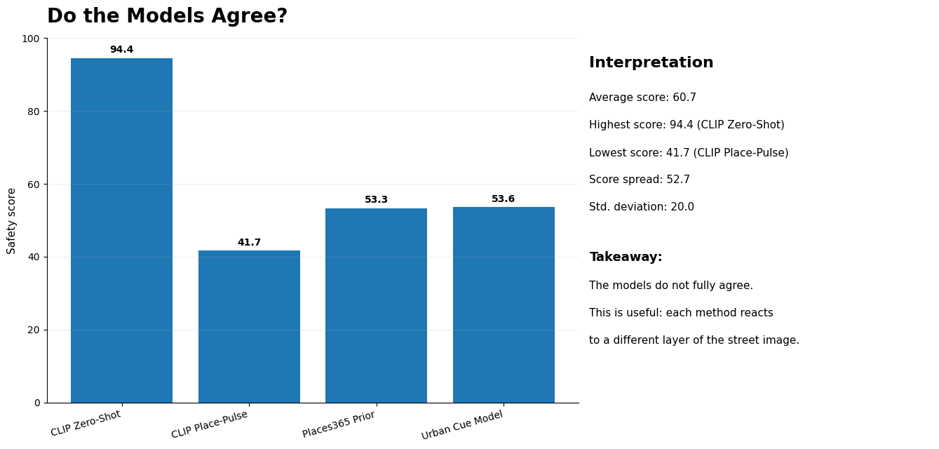
In this test, it gave the highest safety score.
That is understandable. The image shows a bright pedestrian street with people, cafés, sunlight, and visible activity. These elements strongly match the idea of a “safe urban street.”
But this method is also sensitive to wording. If the prompts change, the score can change. So this should not be read as a final truth. It is more like an instant AI impression.
Method 2: CLIP Place-Pulse Style Safety
The second method also uses CLIP, but the prompts are closer to human perception language.
Instead of simply asking “safe or unsafe,” it asks something closer to:
- this place looks safer
- people may feel secure walking here
- this place looks less safe
- people may avoid walking here
This makes the reading more comparative.
In my test, this method gave a lower score than the direct CLIP safety prompt. That is interesting because both methods use CLIP, but the way the question is asked changes the result.
This shows an important point: AI perception scores are not only about the image. They are also affected by how we frame the question.
Method 3: Places365 Scene-Safety Prior
The third method does not directly predict safety.
Instead, it tries to understand the type of place shown in the image. For example, it may read the scene as a street, plaza, market, alley, underpass, or pedestrian area.
After that, a safety prior is assigned based on the scene type.
For example, a pedestrian street or plaza may receive a more positive safety prior than an underpass or parking garage.
This method is useful because it adds context. It does not only look at whether the image feels pleasant. It asks what kind of urban space the image belongs to.
But it is still an indirect method. It does not truly understand all the local safety conditions.
Method 4: Urban Cue-Based Safety Score
The fourth method is the most explainable.
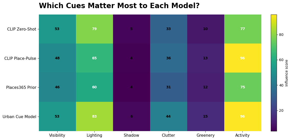
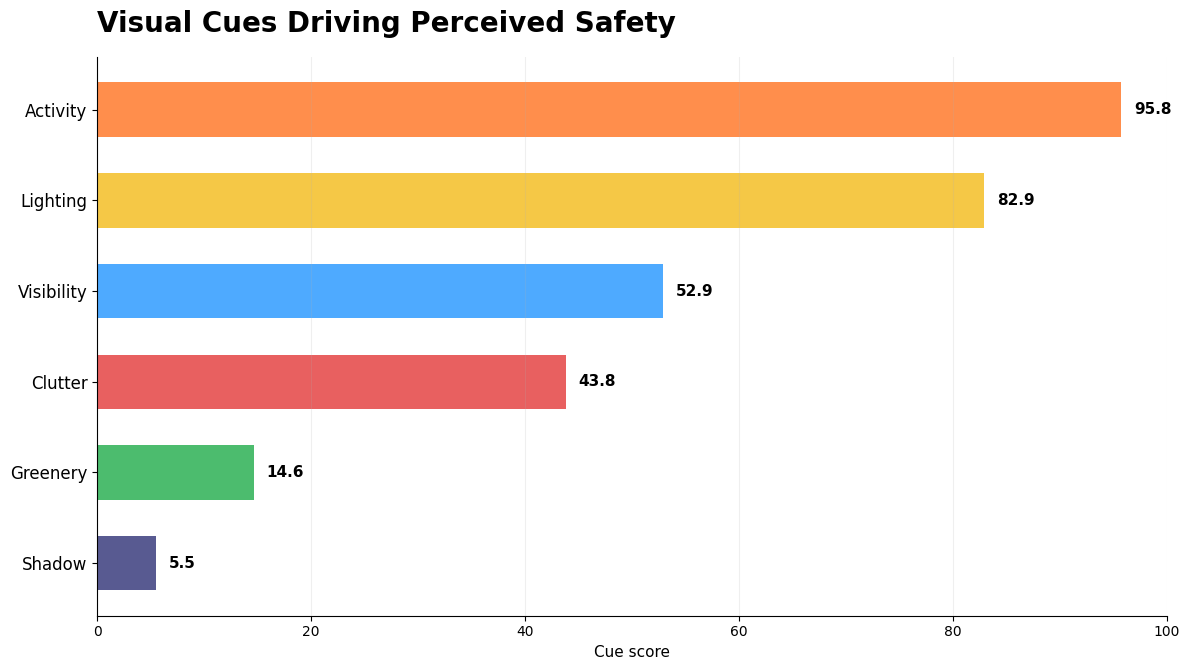
Instead of only using AI prompts, it breaks the image into visible urban cues:
- visibility and openness
- lighting
- shadow
- clutter
- greenery
- activity
Each cue is scored and visualized.
This is useful for AEC because it connects the AI result back to design language. A planner or designer can look at the result and understand why the image is being read in a certain way.
For example, a street may have strong activity and lighting, but still have shadow or clutter. This gives a more balanced interpretation than a single safety score.
© Naveen Maria Fleming / ArchitectsWhoCode
What the results showed
The four methods did not fully agree.
© Naveen Maria Fleming / ArchitectsWhoCode
The direct CLIP safety method gave the highest score. The other methods were more moderate.
This does not mean one model is correct and the others are wrong.
It means each method is looking at the image through a different lens.
One method reacts strongly to the overall impression of a bright, lively street. Another method uses human-perception-style language. Another reads the urban scene type. The cue-based method looks at visible design features.
This is the main insight of the experiment:
The same street image can produce different safety readings depending on how the AI method is designed.
Why this matters?
For architects, urban designers, planners, and developers, this kind of workflow can be useful.
AI can help quickly compare street images, design options, or public realm conditions. It can highlight where a space may feel open, active, bright, cluttered, or visually uncomfortable.
But AI should not be treated as a final decision-maker. A safety perception score should be seen as a starting point for discussion, not a final answer.
The real value is not the number itself. The value is in asking:
- Why did one model score the street higher?
- Which visual cues supported the safety reading?
- Which cues reduced the score?
- Do different models agree or disagree?
- What can a designer improve?
These are useful questions for early-stage urban analysis.
A simple takeaway
This experiment shows that AI can read visual safety cues, but it does not read them in only one way.
A bright and active street may look very safe to one model, but more mixed to another model when cues like shadow, clutter, and openness are considered.
For AEC professionals, this is useful because perceived safety is not just one number. It is made from many visual and spatial conditions.
AI can help reveal those conditions faster.
It cannot replace human judgement, local knowledge, or real site analysis. But it can support a more informed design conversation.
Final thought
The question is not:
Can AI perfectly predict whether a street is safe?
The better question is:
Can AI help us understand how safety is visually perceived?
For me, that is where the value is.
AI can become a quick visual intelligence layer for urban analysis. It can help designers and planners test images, compare places, and explain why one street may feel safer than another.