Can image-derived visual cues support first-pass design review?
Design teams rarely move forward with one idea from the beginning.
Before a review, there are usually multiple directions on the table: one option may feel calmer and more corporate, another may feel warmer, deeper, or more expressive. The question is not always which one is best? Sometimes the more useful question is:
What is actually different between these options, and what should we discuss in the review?
That is what I wanted to test.
Not whether AI can “choose” a façade.
Not whether a generated image contains real BIM data.
Not whether a model can replace an architect.
The experiment is simpler:
Can AI-generated façade options be processed into a structured design overview using image-derived visual cues?
The setup
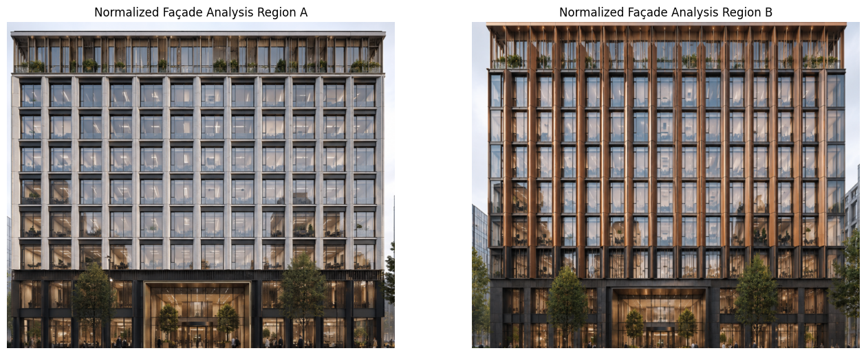
For this test, I used two façade options for the same office-building scenario.
Option A is a calmer corporate grid façade. It has a more regular frame, lighter material expression, and a clearer horizontal/vertical order.
Option B is a warmer climate-screen façade. It introduces stronger vertical fins, bronze tones, deeper façade articulation, and a more expressive identity.
The goal was not to declare a winner. The goal was to build a first-pass review workflow that could answer:
- Which option feels more open?
- Which has stronger vertical emphasis?
- Which one reads warmer or more materially expressive?
- Which appears more complex?
- Which has more visible shadow/depth?
- Which one may have stronger street-level activation?
- Where are the visual differences concentrated?
Why this needs more than just prompting
At first, it is tempting to upload two images to an AI model and ask:
“Compare these façade options.”
That gives a nice written answer, but it can feel vague. It might say one option is “more dynamic” or “more open,” but it does not show why.
So I wanted to add an evidence layer.
Instead of only asking AI to describe the images, I processed the images using Python and extracted measurable visual cues.
The workflow became:
Option A image
Option B image
↓
Isolate main façade zone
↓
Normalize both façade crops
↓
Detect façade bands and visual profiles
↓
Extract visual cues
↓
Translate technical metrics into design language
↓
Generate first-pass review overview
This is where the experiment became more interesting.
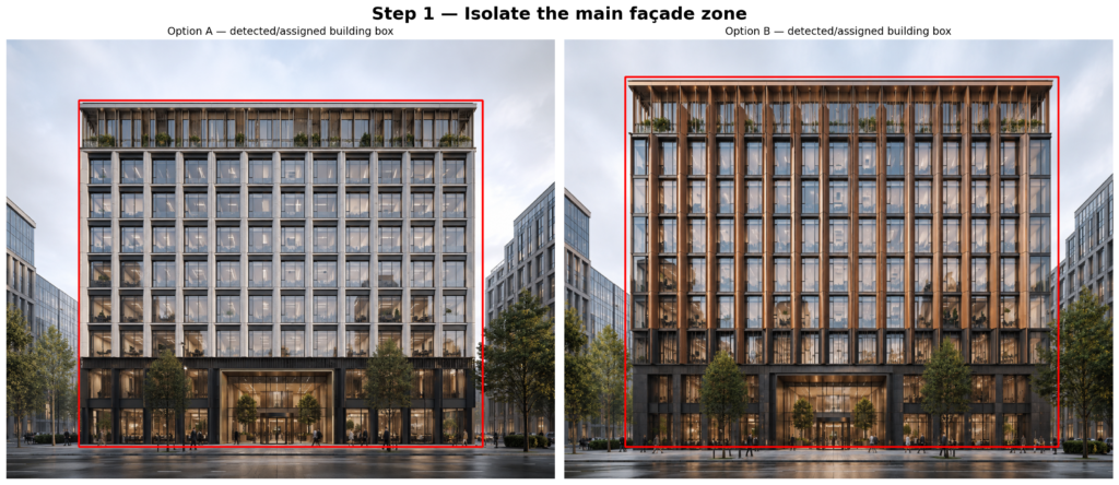
Isolating the main façade
The two images were not perfectly aligned. Option B was slightly larger in frame and had a different façade depth. So using the same crop for both images would not be fair.
The first step was to isolate the main façade area in each image.
This does not create real geometry. It simply makes the image comparison more controlled.
© Naveen Maria Fleming / ArchitectsWhoCode
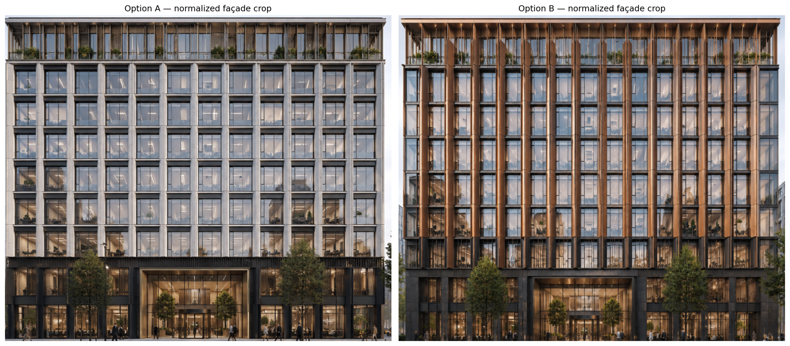
Normalizing both façade crops
After isolating the building, both façade crops were resized to the same analysis frame.
This matters because visual metrics like edge density or glazing ratio can be affected by scale. If one image is larger or closer, the comparison becomes misleading.
© Naveen Maria Fleming / ArchitectsWhoCode
At this point, the workflow is already more controlled than a simple image-to-image comparison.
Detecting repeated façade bands
Next, I extracted horizontal façade bands from the images.
This was useful for two reasons.
First, it gives a sense of floor rhythm and façade repetition. Second, it shows that the system is not only looking at color or brightness. It is reading the image as a façade with repeated architectural structure.
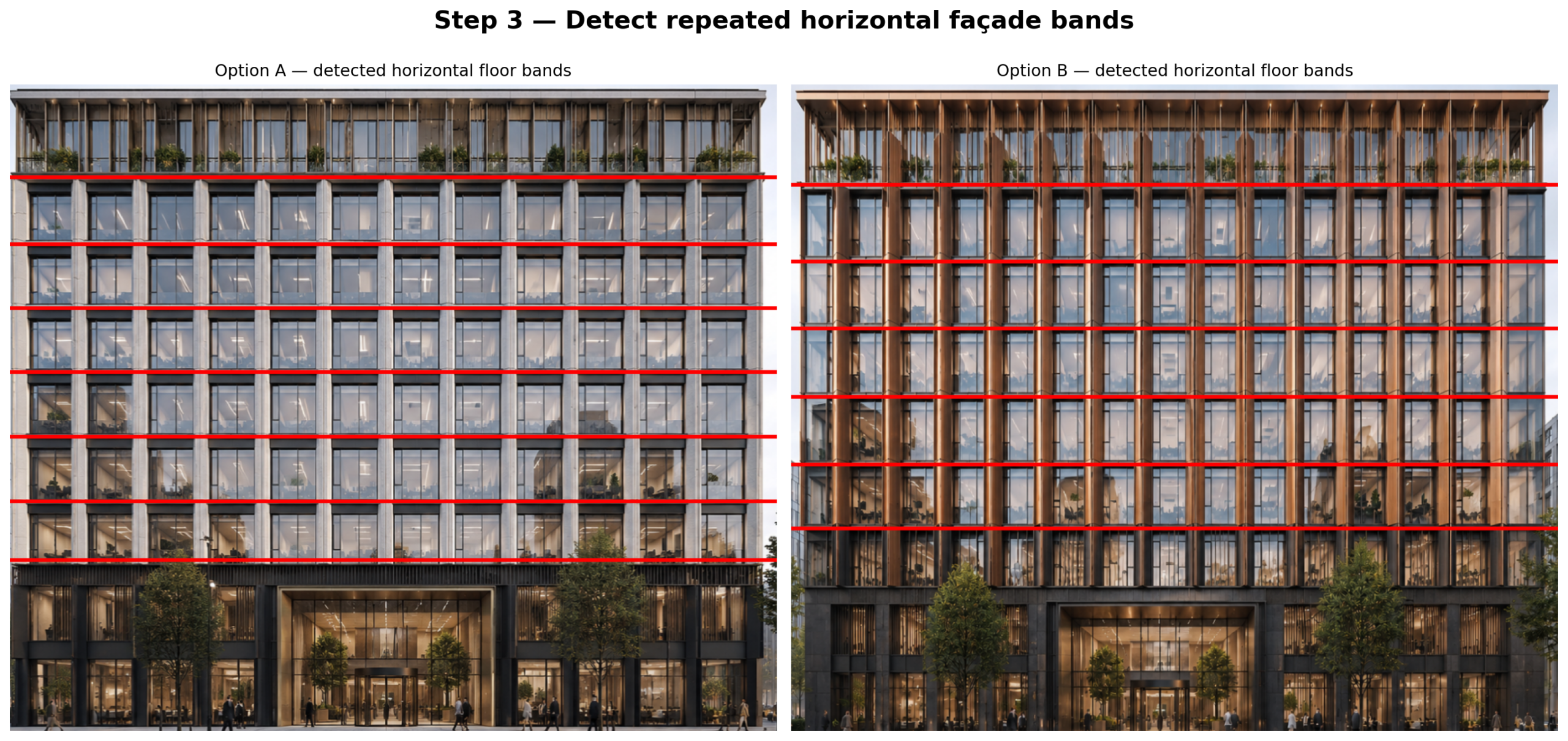
structure from image edges. © Naveen Maria Fleming / ArchitectsWhoCode
The detection is not perfect, and that is fine. This is not a BIM model. It is a visual prototype. The purpose is to detect enough structure to support a first-pass review.
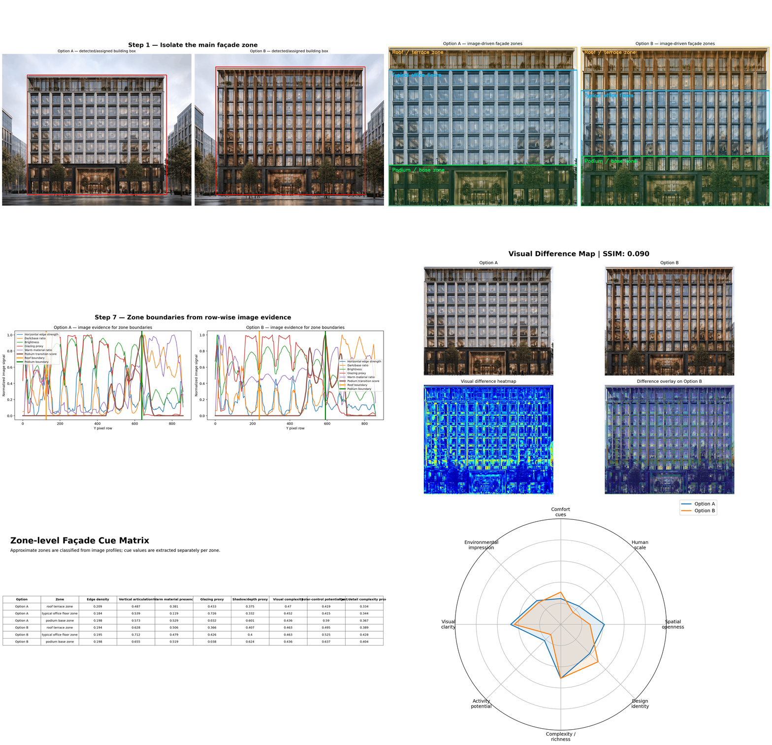
Approximate façade zoning
I also tested a zoning layer: roof/terrace, typical office floors, and podium/base.
This step was more challenging. The façade options are visually different, especially Option B with its strong bronze vertical fins. That makes automatic zone detection harder.
Still, the zoning is useful as an approximate review layer because façade design is not read uniformly. The podium, typical floors, and roof zone each carry different design responsibilities.
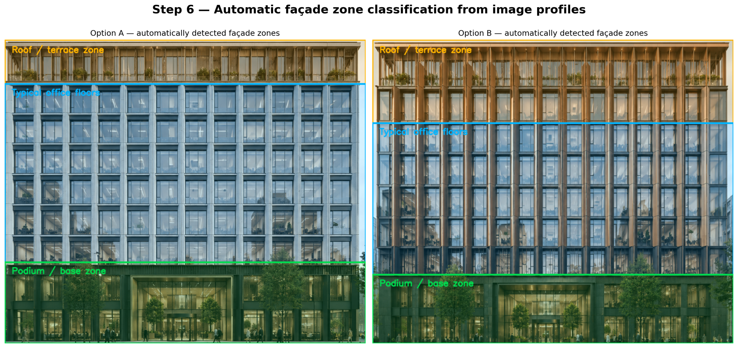
This is one of the important limitations of the experiment. The zoning should be treated as an approximate image-based classification, not as a precise architectural section.
Extracting image-derived façade cues
Once the façade crops were prepared, I extracted a set of visual metrics.
The technical metrics were:
| Technical metric | Design-facing meaning |
|---|---|
| Edge density | Façade articulation / visual complexity |
| Vertical edge ratio | Vertical emphasis |
| Horizontal edge ratio | Horizontal emphasis / rhythm clarity |
| Warm hue ratio | Material warmth |
| Dark area ratio | Shadow / depth cue |
| Lower-façade glazing | Street-level activation cue |
| Blue-gray / bright regions | Glazing / openness proxy |
| Green pixel ratio | Greenery / comfort cue |
| Brightness | Environmental brightness |
| Entropy | Visual richness / complexity |
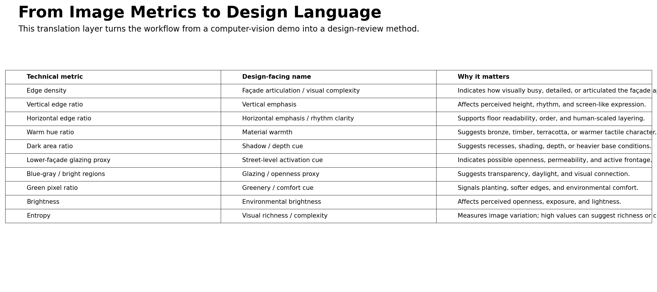
This translation layer is important. Without it, the experiment becomes only a computer vision demo. With it, the output becomes more useful for architects and design teams.
What the image processing found
The image-derived façade cue matrix produced some useful differences.
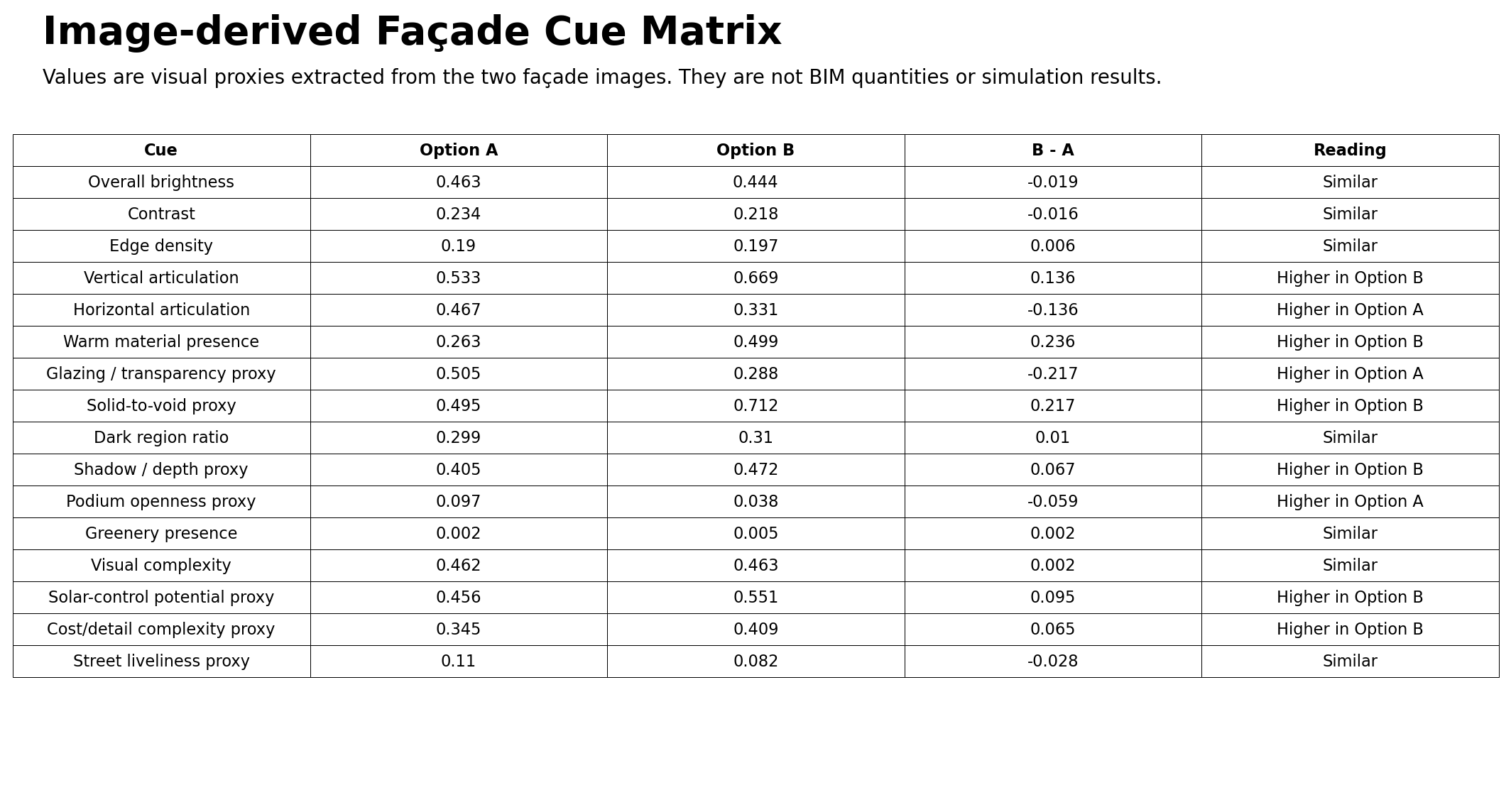
The strongest readings were:
Option A
Option A scored higher in:
- glazing / transparency proxy
- horizontal articulation
- podium openness proxy
- spatial openness
- human scale
- activity potential
This matches the visual impression. Option A feels more open and more regular. The façade grid is calmer, and the lower portion reads more transparent and accessible.
Option B
Option B scored higher in:
- vertical articulation
- warm material presence
- solid-to-void proxy
- shadow / depth proxy
- solar-control potential proxy
- cost/detail complexity proxy
- design identity / character
This also makes sense. Option B has a stronger bronze screen, deeper vertical elements, and a warmer façade identity. It feels more expressive and climate-responsive, but also more complex.
Design-facing review matrix
To make the results readable for design review, I translated the technical values into design-facing categories.
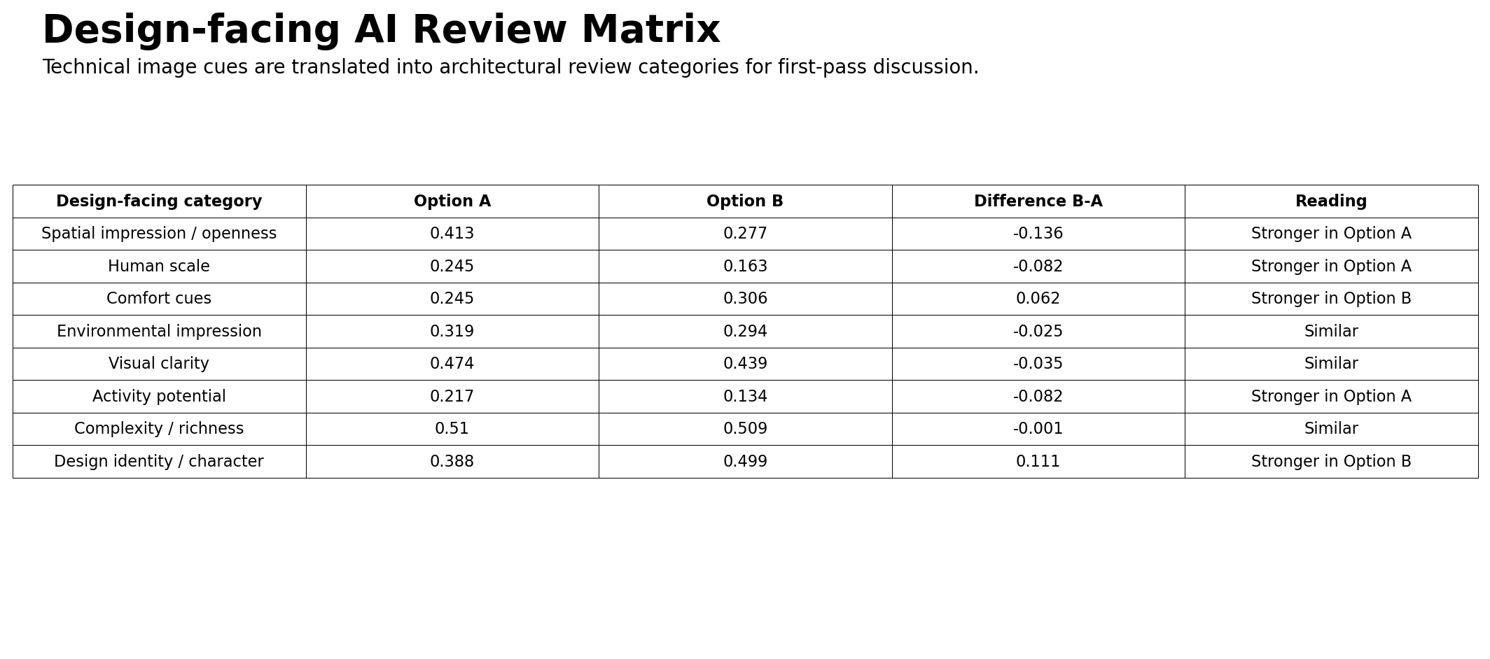
The result was:
- Spatial impression / openness: stronger in Option A
- Human scale: stronger in Option A
- Comfort cues: stronger in Option B
- Environmental impression: similar
- Visual clarity: similar
- Activity potential: stronger in Option A
- Complexity / richness: similar
- Design identity / character: stronger in Option B
This is a useful review summary because it does not say one façade is better. Instead, it frames the trade-off:
Option A feels more open, legible, and accessible.
Option B feels warmer, deeper, and more character-driven.
That is exactly the kind of overview a design team could use before a review.
Visual evidence masks
To make the workflow more transparent, I also exported masks for both options.
These included:
- edge / articulation mask
- glazing proxy mask
- warm material proxy
- shadow / depth proxy
- greenery proxy
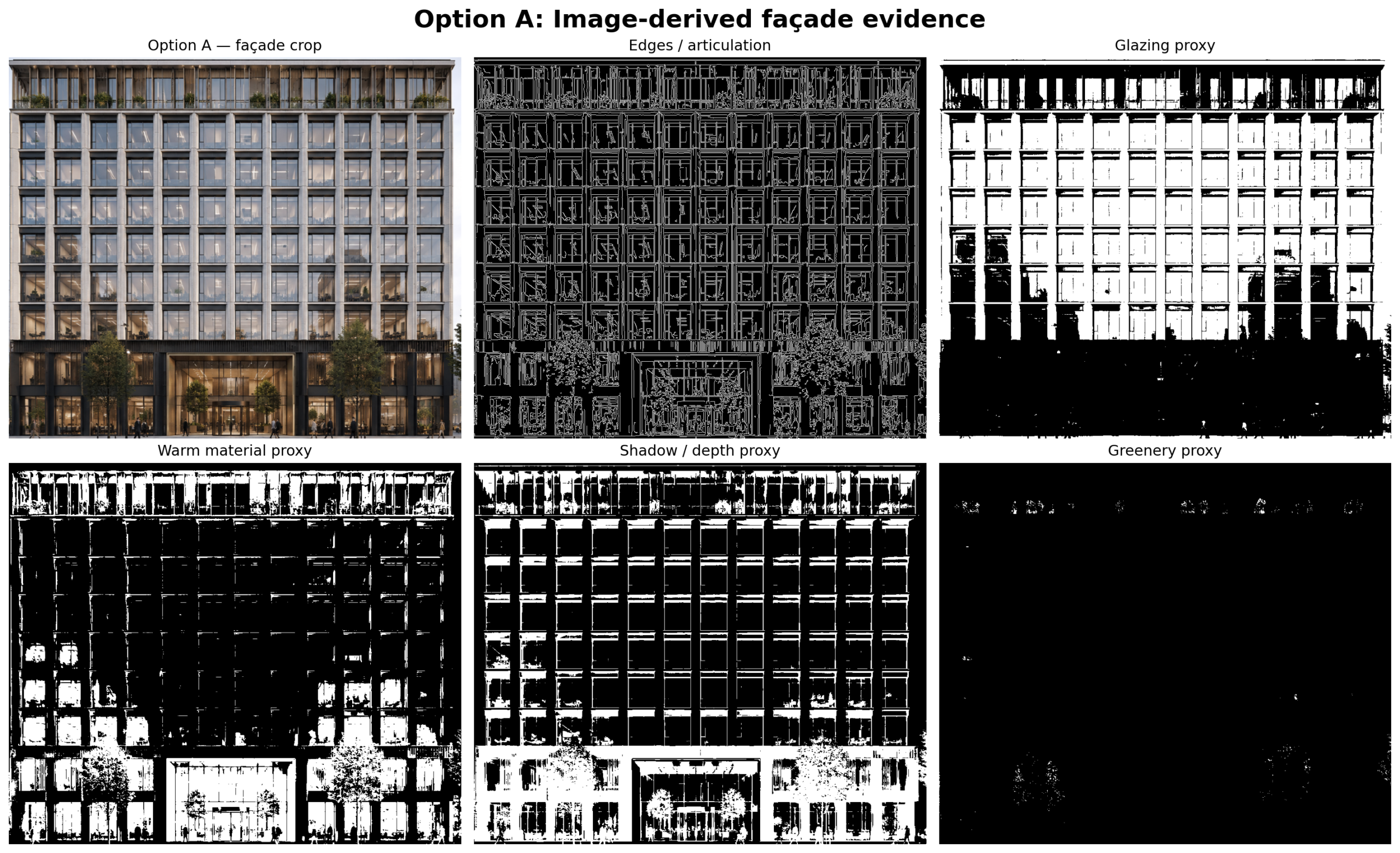
Some masks worked better than others. For example, the edge and warm-material masks were useful. The glazing detection was less stable because reflections, interior lights, and façade frames can confuse the mask. This is expected in image-based analysis.
That is also why I call these visual proxies, not exact façade measurements.
Visual difference map
I also created a visual difference map between the two normalized façade crops.
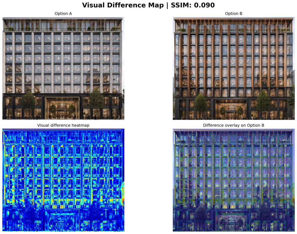
The SSIM similarity score was very low, which indicates that the two options are visually quite different after normalization.
But this should be interpreted carefully. Since these are not exact geometry-matched renders from the same BIM model, the heatmap is not an exact design-change map. It is better described as a visual difference map.
It shows where the image changes are strongest, especially around:
- vertical fins
- window rhythm
- upper façade articulation
- material tone
- podium expression
What worked well
The strongest part of the experiment was the translation from image metrics to design review language.
The workflow was able to identify that Option B has stronger:
- vertical emphasis
- material warmth
- visual identity
- shading/depth cues
- likely cost/detail complexity
It also identified that Option A has stronger:
- openness
- glazing proxy
- human-scale reading
- activity potential
- calmer rhythm
This feels believable because it matches the visual reading of the two options.
What did not work perfectly
The experiment also exposed several limitations.
First, façade zoning is difficult from image alone. The system can detect horizontal bands and visual transitions, but it does not truly know what is podium, office floor, or terrace unless the image makes that clear.
Second, glazing detection is imperfect. Glass is visually complicated. It includes reflections, dark mullions, bright interiors, and sky tones. A simple mask cannot fully separate glass from other reflective surfaces.
Third, the system does not know real scale unless scale is assigned or calibrated. It cannot know real floor height, window dimensions, construction depth, cost, or energy performance from an image alone.
Fourth, the energy-related values are only proxies. A deeper or darker façade may suggest shading potential, but actual performance would require orientation, climate data, glazing specs, U-values, g-values, and simulation.
So the result is not a technical façade report.
It is a structured pre-review overview.
What this means for architects
For me, the interesting part is not that AI can generate a façade image.
The interesting part is whether we can build a bridge between:
visual design options
and
structured design review
Most early design conversations are based on impressions:
- “This feels more open.”
- “This one has stronger identity.”
- “This option looks heavier.”
- “This façade feels more premium.”
- “This one may be too busy.”
Those impressions are valid, but they are often difficult to organize.
This experiment suggests that image-derived visual cues can help structure that conversation.
Not replace it.
Not automate it.
Not make the final decision.
But support it.
Possible design review questions generated from the workflow
Based on the comparison, a design team could ask:
- Does Option B’s stronger vertical articulation improve identity, or does it risk becoming visually busy?
- Does Option A’s higher openness make it more inviting at street level?
- Is Option B’s warmer material expression more appropriate for the project identity?
- Does the deeper shadow/depth cue in Option B suggest better solar-control potential?
- Is Option B’s likely detailing complexity acceptable for the project budget?
- Can Option A’s clarity be combined with Option B’s stronger façade character?
- Which option should move forward into BIM or Rhino for real performance testing?
This is where the workflow becomes useful.
It does not produce a final answer.
It produces better questions.
Conclusion
This experiment supports the hypothesis that AI can help compare façade options when image generation is combined with image processing. Though accuracy is questionable.
For early-stage façade review, that could be useful.
Option A reads as the more open, regular, and accessible corporate façade.
Option B reads as the stronger identity-driven climate-screen façade, with more warmth, depth, and vertical emphasis.
The next step would be to take the preferred direction into a real design model, where scale, geometry, cost, daylight, and energy performance can be properly tested.
So the answer to the question is:
Yes, AI can support first-pass façade comparison not by replacing design judgment, but by organizing visible evidence into a clearer review conversation.